Inclusive Package Redesign
Challenged to redesign a medicinal package to improve readability and inclusive design aspects related to its overall function.
What changed?
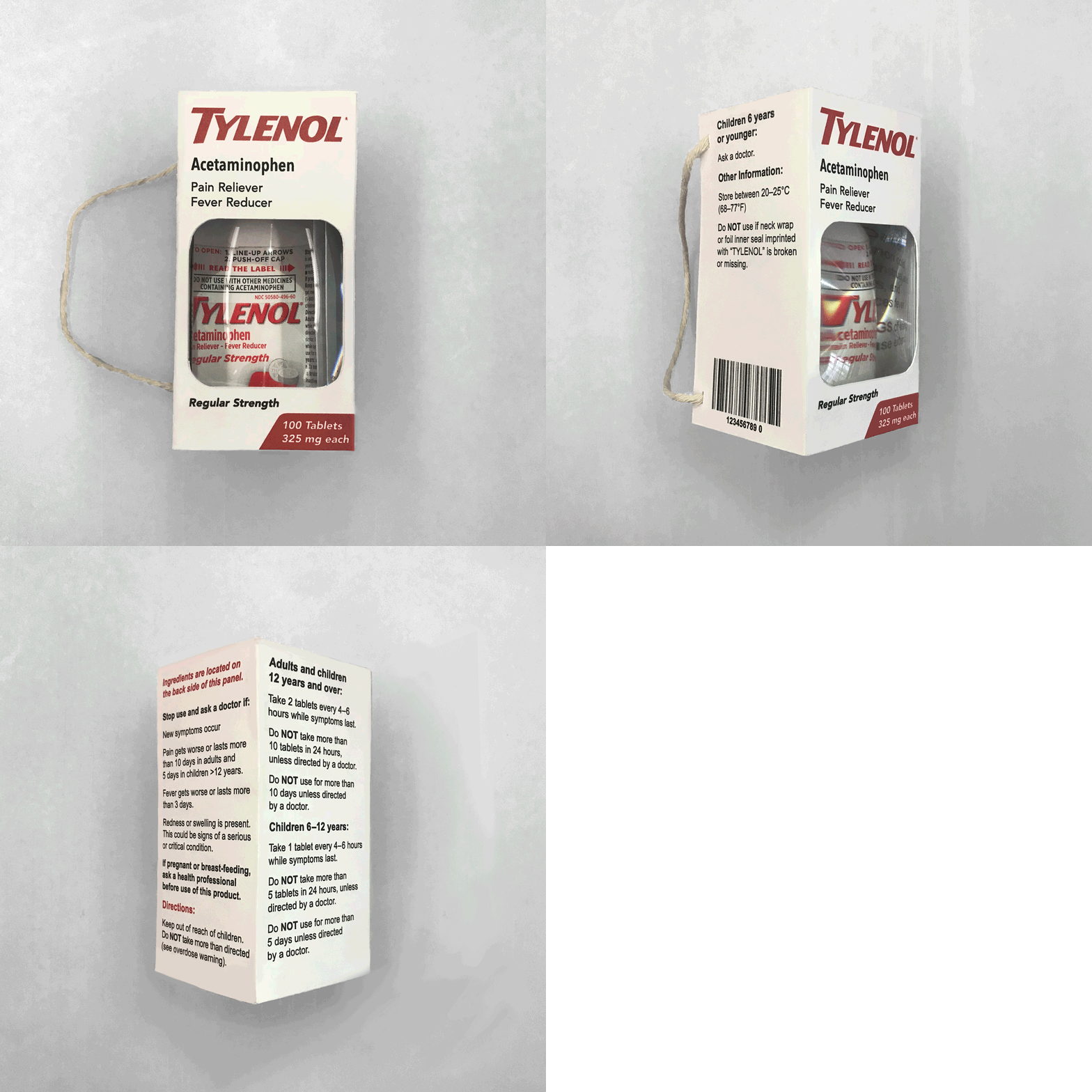
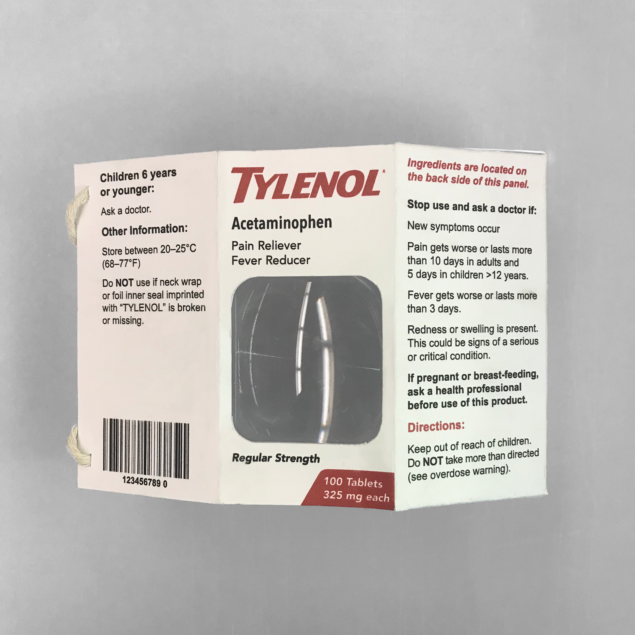
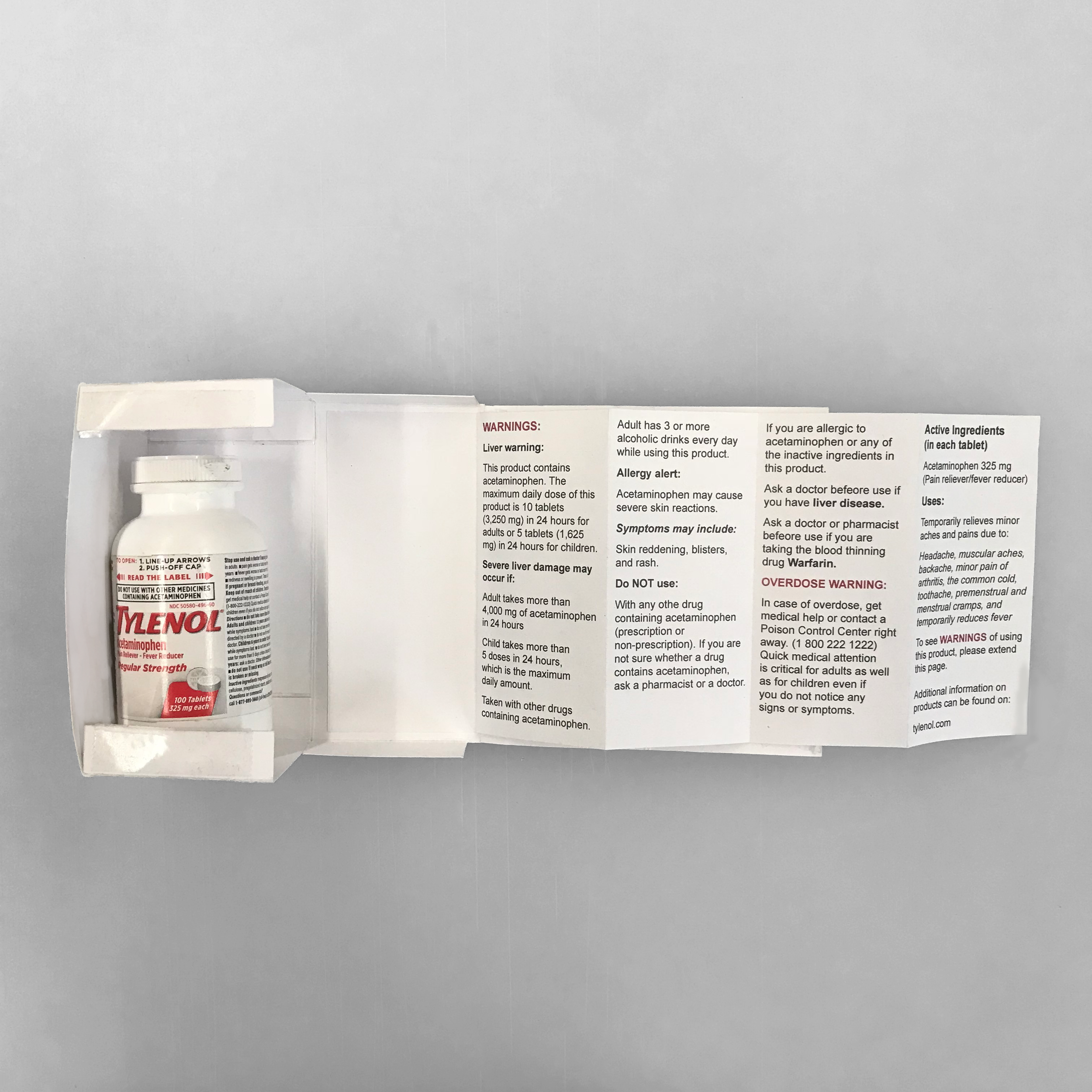
Originally, Tylenol’s packaging was very condensed and difficult to read. I made the decision to increase the typeface size from 6pt to 10pt with 12pt bolded titles allowing users who suffer from sight difficulties to have an easier time reading ingredients and warnings on the package itself.
Once I began thinking more inclusively, I wanted to push the limits of typical packaging. I started to incorporate designs that would allow more consumers to properly use the product, without having to dispose of the package itself.
Inclusive features
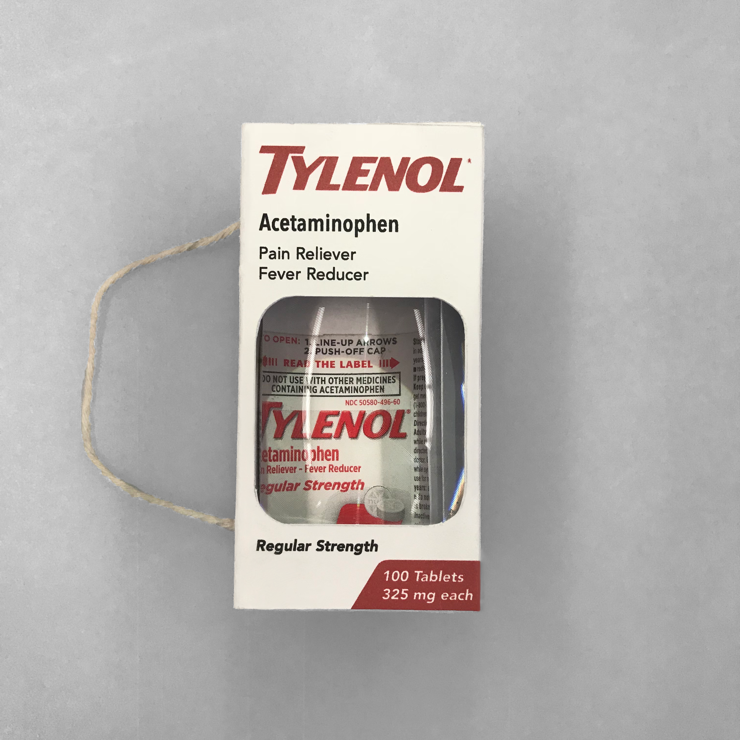
Keeping this idea of inclusivity, I thought about the consumers and how functionally they would be using this product. My first thought was people with muscle and joint pain; how could I make a package that helps them? Individuals with arthritis struggle with everyday tasks that require their hands to function with full mobility. To combat this, I incorporated a twine handle to give ease of access to the package.
Since the project did not include redesigning the bottle, I included a magnifying screen on the front to help user’s read the smaller fonts.
Reusable package
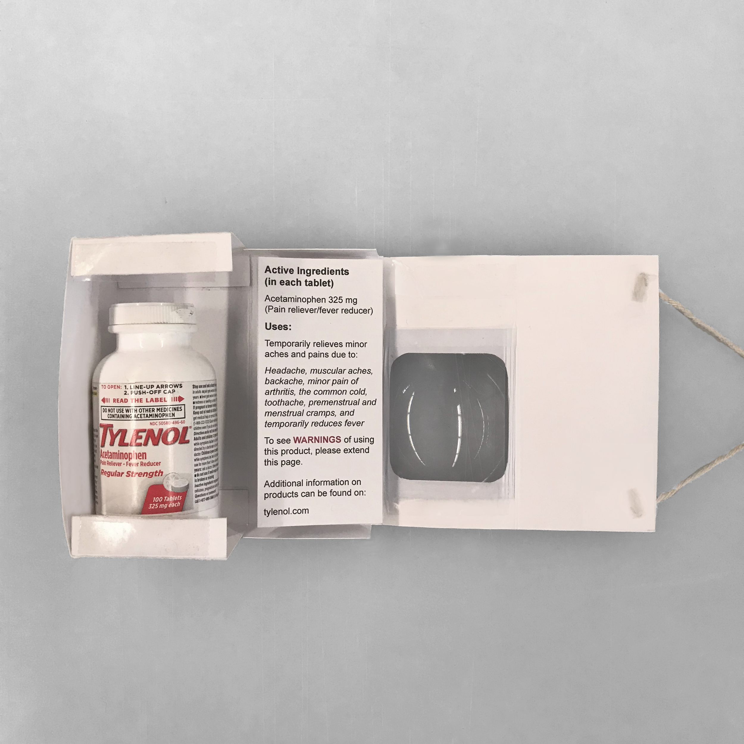
The package itself opens up, completely flat, to allow users to comfortably use the magnifying screen onto any surface. Inside, the directions and warnings fold out so that, before the consumer takes the bottle out, they notice and read it before taking the medication.
Since the newly designed package has more functionality to it, my hope is to also decrease waste of packaging, giving it a new purpose to stay on the shelf.
This redesign was given ASU’s Design Excellence Award in 2019.
